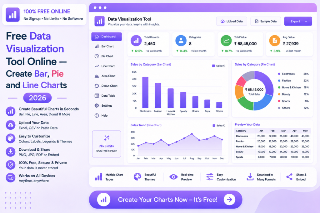
A data visualization free online tool lets you create professional charts from any data instantly — no design skills or software needed.
Free Data Visualization Tool Online — Create Bar, Pie and Line Charts 2026
Turn your raw data into professional charts and graphs instantly — no software, no signup, no payment required.
📊 Visualize Your Data Free — Try Now
📋 In This Guide
What is Data Visualization?
Data visualization is the process of representing data in graphical form — charts, graphs and diagrams — to make patterns, trends and insights immediately visible. Instead of reading rows of numbers in a spreadsheet, a well-designed chart communicates the same information in seconds.
Effective data visualization is essential for business presentations, reports, academic research and any situation where data needs to be communicated clearly to an audience. Our free data visualization online tool makes this process fast and accessible to everyone.
✅ MySmartWork’s data visualization free online tool creates professional bar, pie and line charts from your data instantly — export as image or PDF, completely free, no signup required.
How to Create Charts Free Online — Step by Step
Enter or upload your data
Paste your data directly into the tool or upload an Excel or CSV file. The tool reads your columns and values automatically.
Select chart type and customize
Choose your chart type — bar, line, pie, scatter or area. Customize colors, labels and titles to match your needs.
Export your chart
Download your chart as a high-resolution PNG image or PDF — ready to use in presentations, reports and documents.
⚠️ Tip: For best results, keep your data clean and well-organized before uploading. Use the AI Data Cleaner tool first if your data has formatting issues.
Chart Types Available
Bar Chart
Compare values across categories side by side
Line Chart
Show trends and changes over time
Pie Chart
Display proportions and percentage breakdowns
Area Chart
Visualize cumulative values over time
Scatter Plot
Show correlation between two variables
Horizontal Bar
Compare long category names clearly
Free vs Paid Tools
| Feature | MySmartWork (Free) | Paid Tools |
|---|---|---|
| Cost | ✅ Completely Free | ❌ Monthly subscription |
| Signup Required | ✅ No | ❌ Yes |
| Chart Types | ✅ Bar, Line, Pie, Scatter | ✅ More advanced types |
| Export Quality | ✅ High-res PNG, PDF | ✅ Multiple formats |
| Live Data Connection | ⚠️ Upload based | ✅ Real-time data |
| File Privacy | ✅ Processed in browser | ⚠️ Uploaded to server |
Common Use Cases
💼 Business Presentations
Create professional sales charts, revenue graphs and performance dashboards for management presentations — in minutes rather than hours.
📊 Financial Reporting
Visualize expense breakdowns, budget vs actual comparisons and financial trends with clear charts that make numbers easy to understand at a glance.
🎓 Academic and Research Work
Students and researchers can create publication-quality charts for thesis papers, research reports and academic presentations quickly and easily.
📦 Operations and Inventory
Visualize stock levels, order volumes and supply chain metrics with clear bar and line charts for operations reports and team reviews.
📣 Marketing Analytics
Turn campaign performance data, traffic stats and conversion metrics into clear visual reports that communicate results effectively to stakeholders.
Frequently Asked Questions
Is the data visualization tool really free?
Yes, MySmartWork’s data visualization free online tool is completely free — no hidden charges, no subscription, no signup required.
What data formats are supported?
You can paste data directly, or upload Excel (.xlsx) and CSV (.csv) files for chart creation.
Can I export the charts?
Yes, charts can be downloaded as high-resolution PNG images or PDF files — suitable for both digital use and print.
Is my data safe?
Yes. Your data is processed entirely within your browser and is never uploaded to any external server.
Can I customize chart colors and labels?
Yes, the tool allows you to customize chart titles, axis labels and colors to match your brand or presentation style.
Does it work on mobile?
Yes, the tool is fully mobile-friendly and works in any browser on Android and iPhone devices.
📊 Visualize Your Data Free — Right Now
No signup. No software. No payment. Enter your data and get a professional chart instantly.
Open Data Visualization Tool →